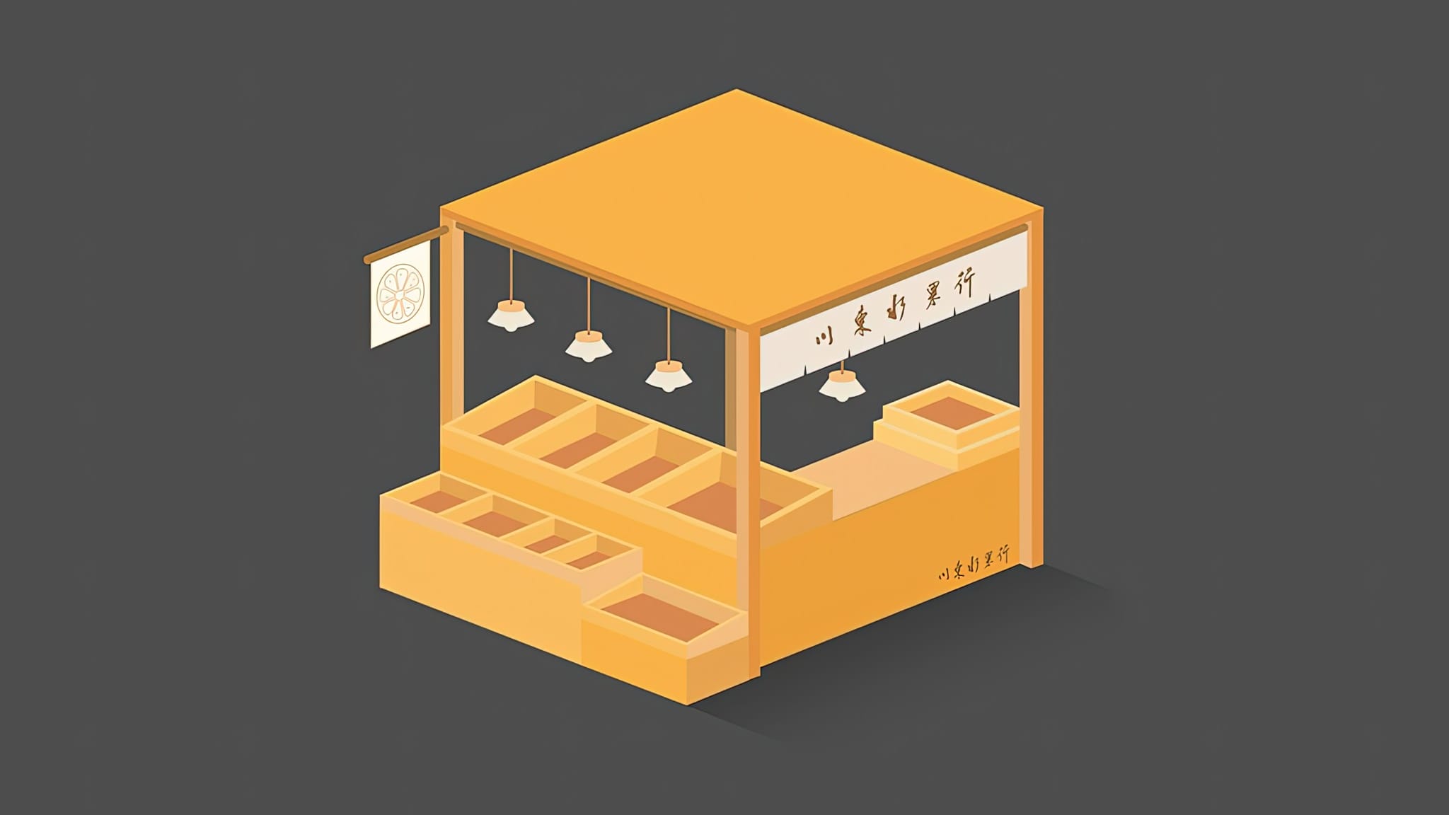
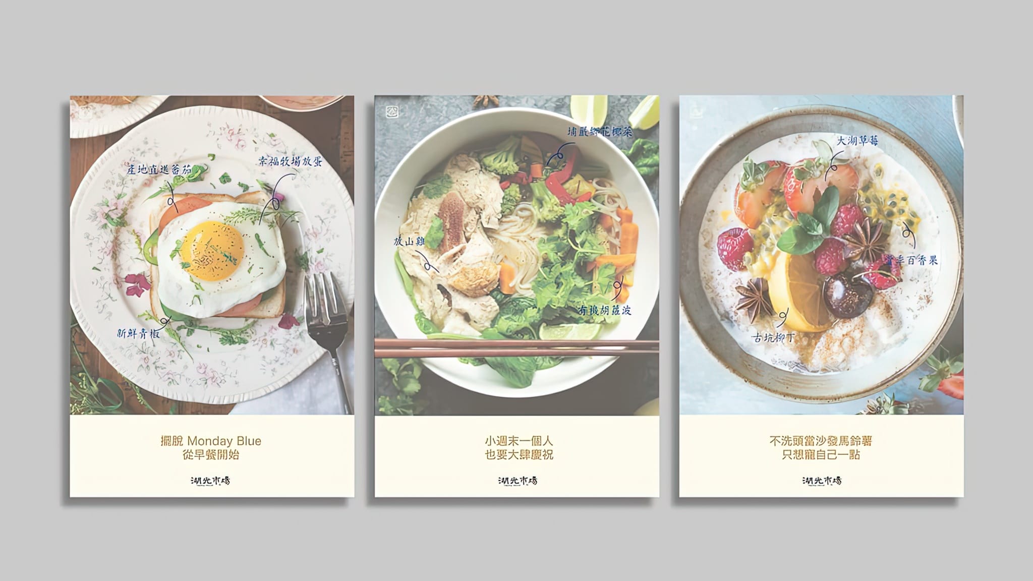
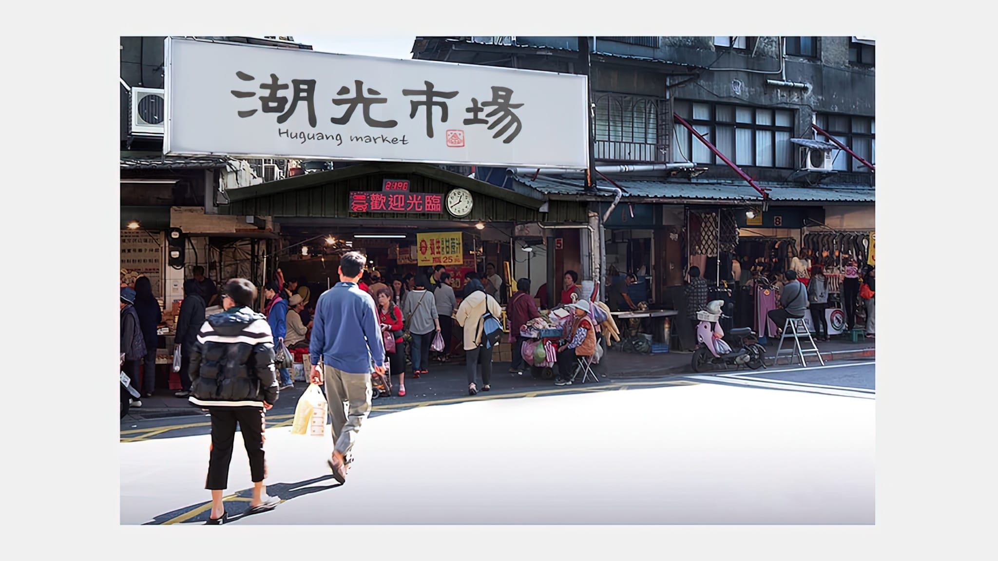
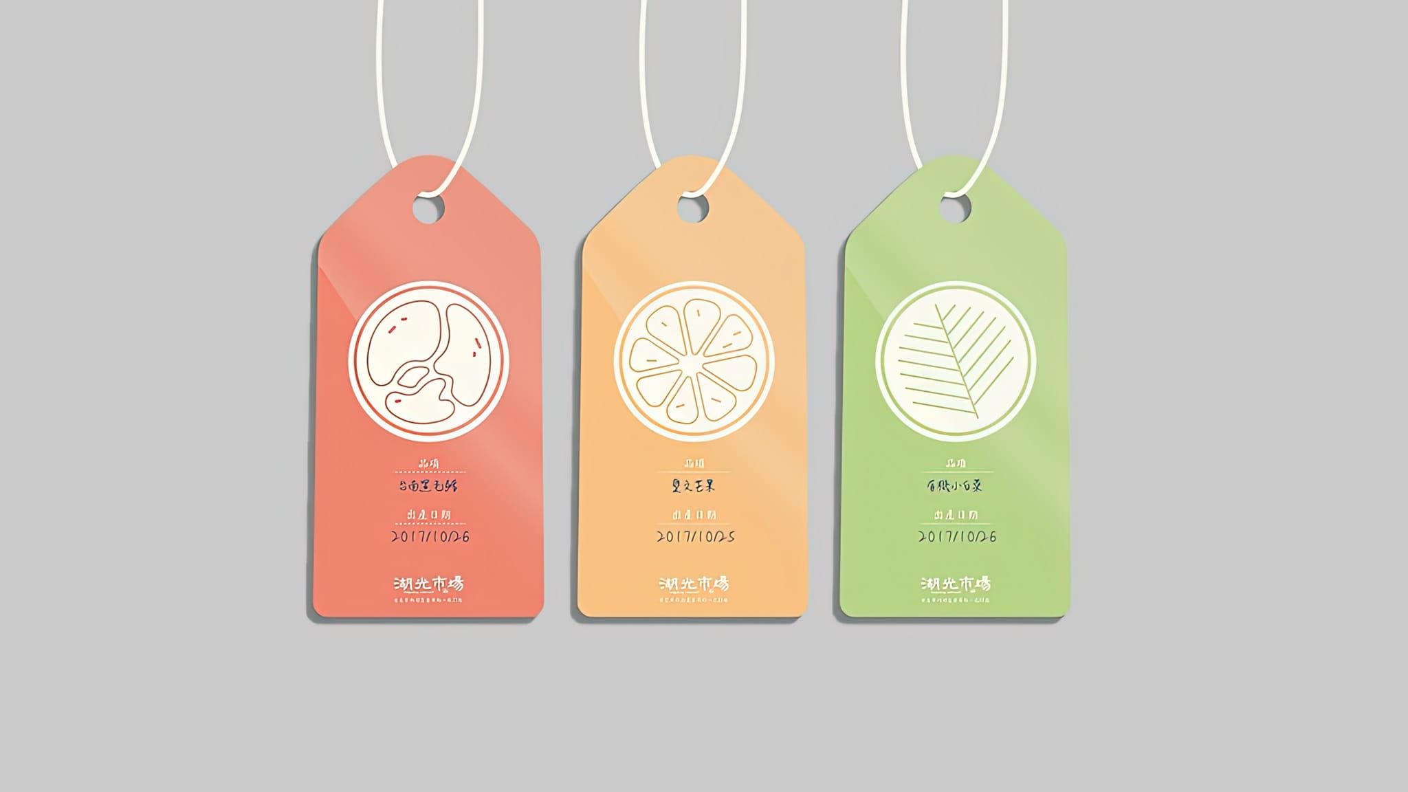
The Huguang Market refurbishment project was a challenging yet exciting experience for me as an artist. The objective of the project was to modernize the market’s image while preserving its traditional significance. Our team’s approach was to use brighter colors and a more modern logo that would attract the younger generation. We also wanted to incorporate calligraphy into the market’s new look to honor its traditional roots.
Brighter Colors
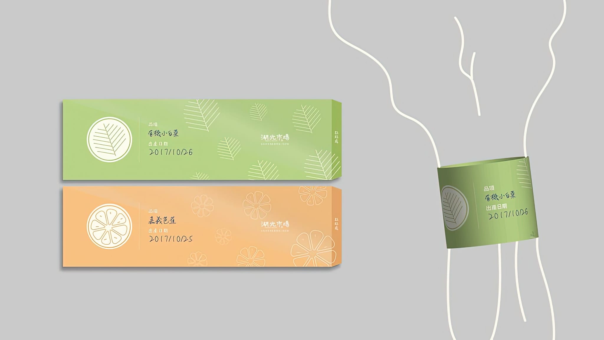
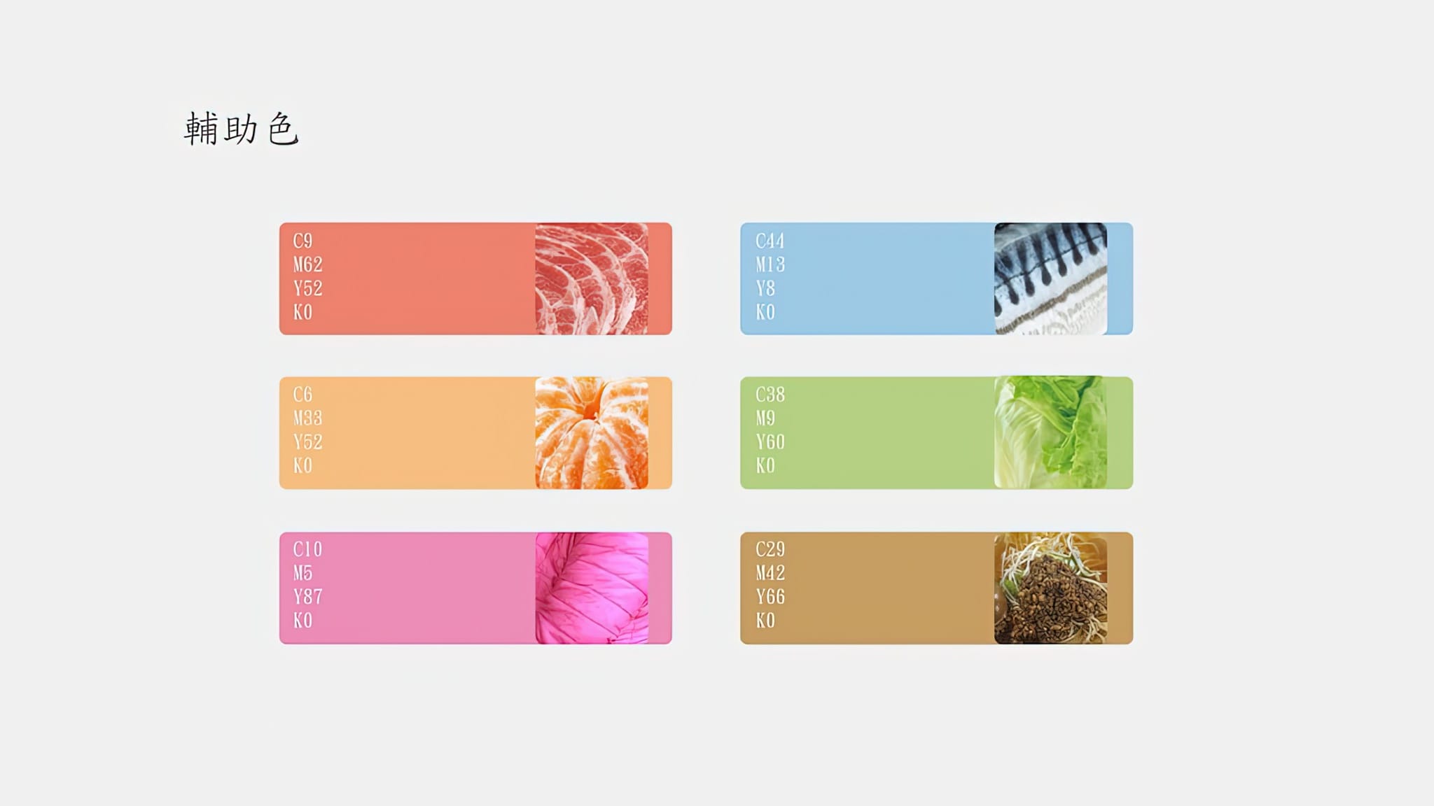
We started by introducing brighter colors to the market’s interior and exterior. The old and dull colors were replaced with vibrant and refreshing hues that brightened up the entire space. This helped to create a welcoming and cheerful atmosphere that appeals to visitors of all ages.
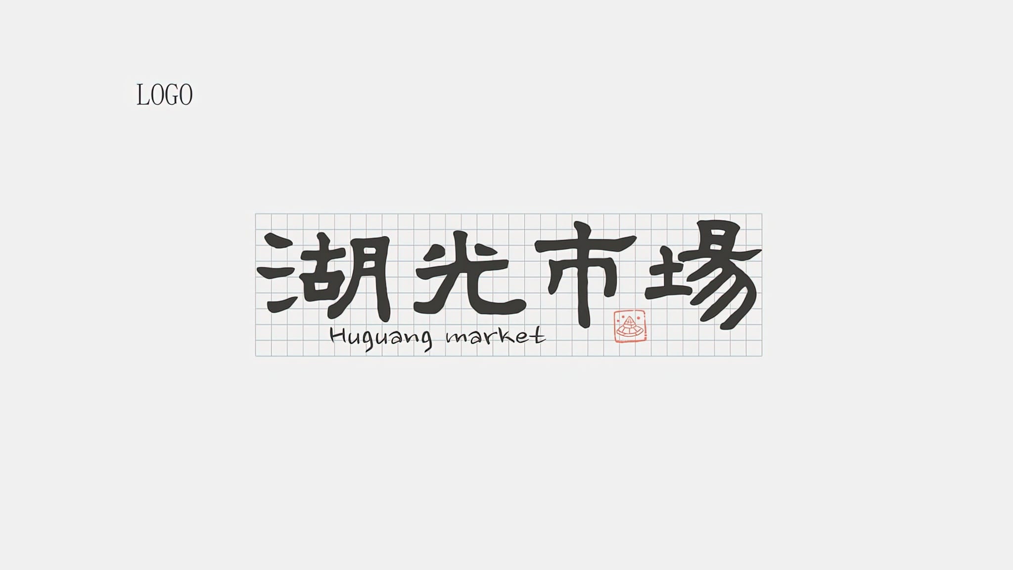
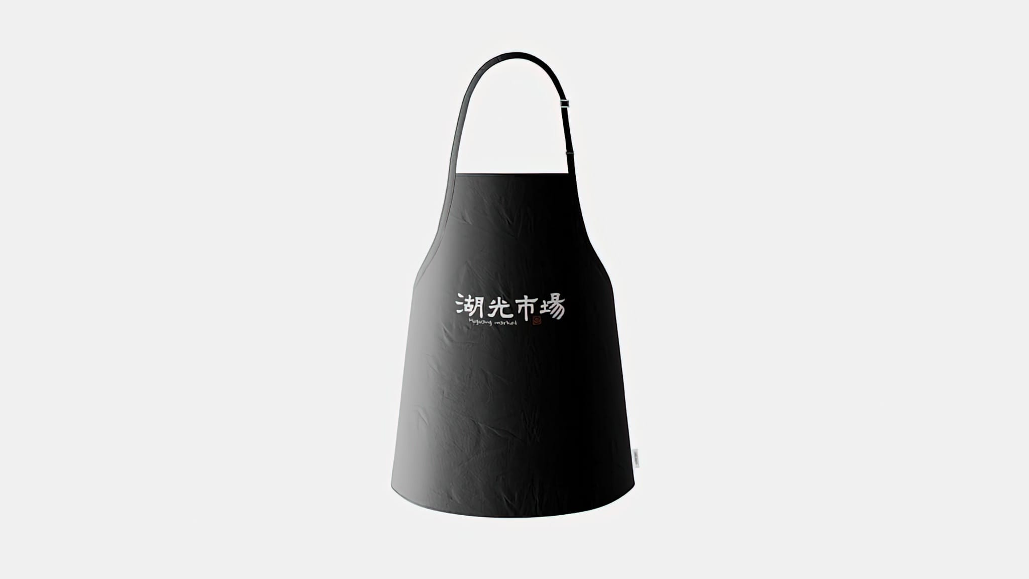
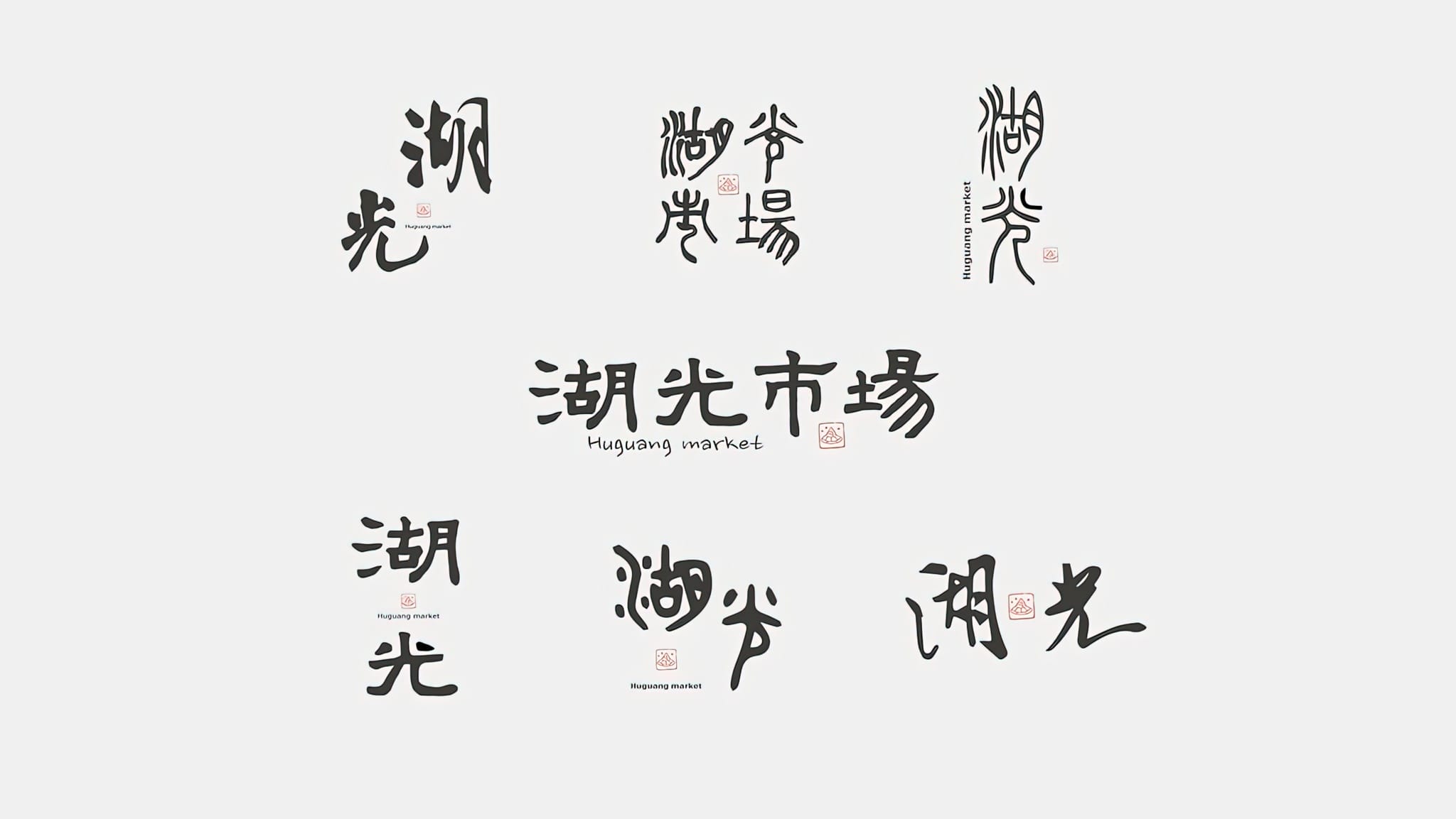
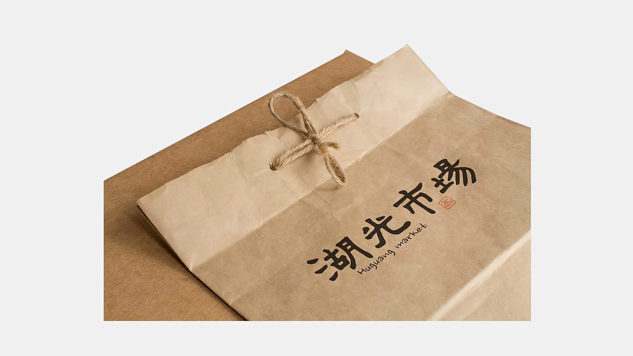
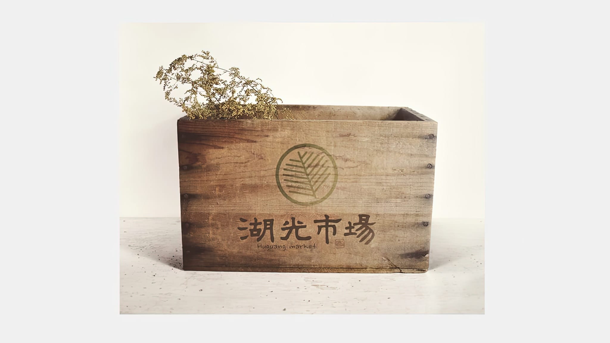
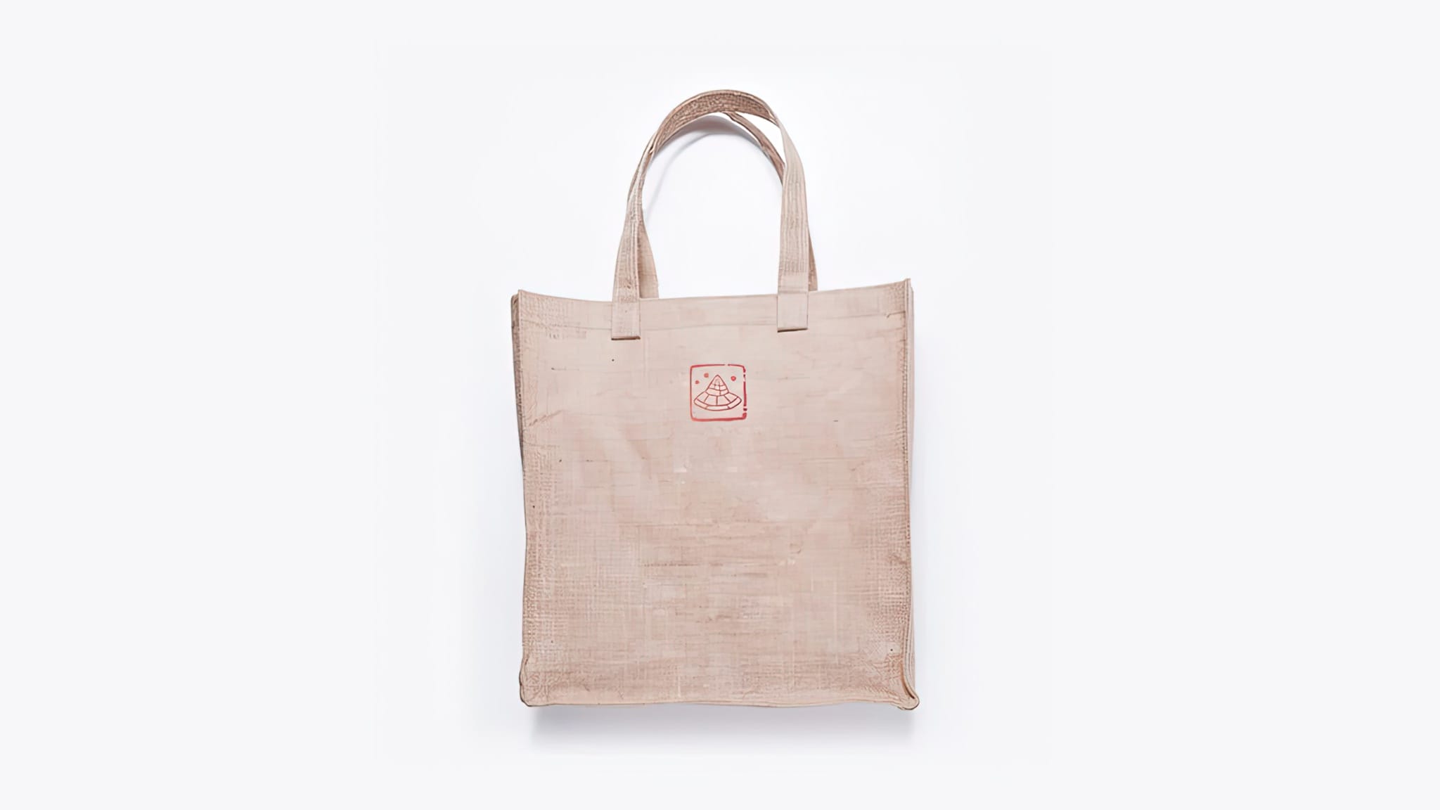
Modern Logo Design
Our team designed a new logo for the market that was simple, modern, and memorable. The logo features a colorful lantern symbolizing the market’s vibrancy and a sleek font that complements its modern look. The new logo helped to establish a strong brand identity for the market and made it stand out among other traditional markets in Taipei.
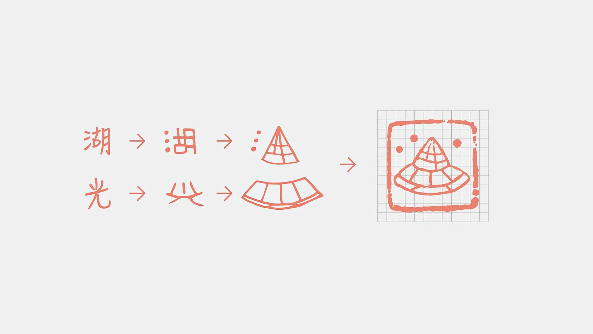
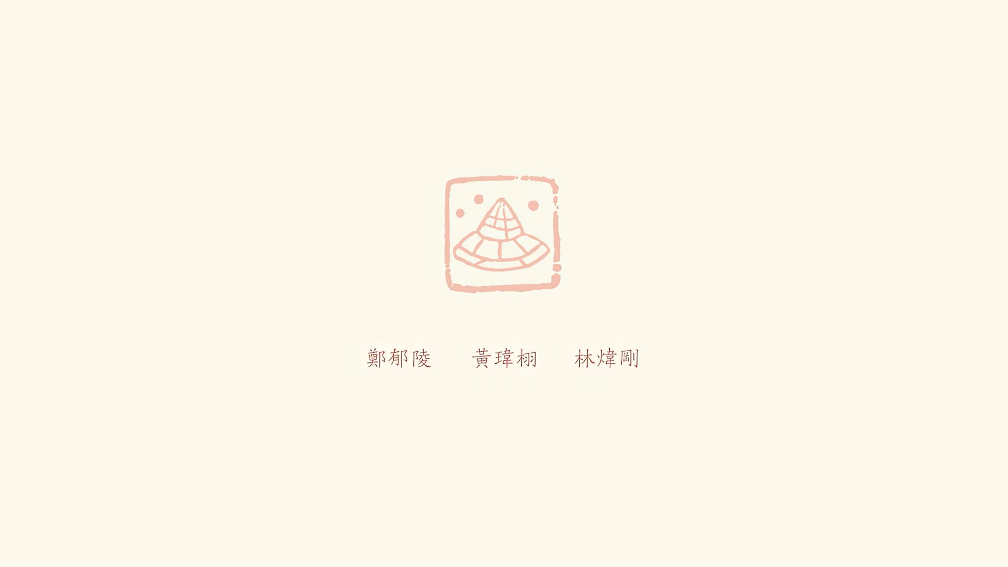
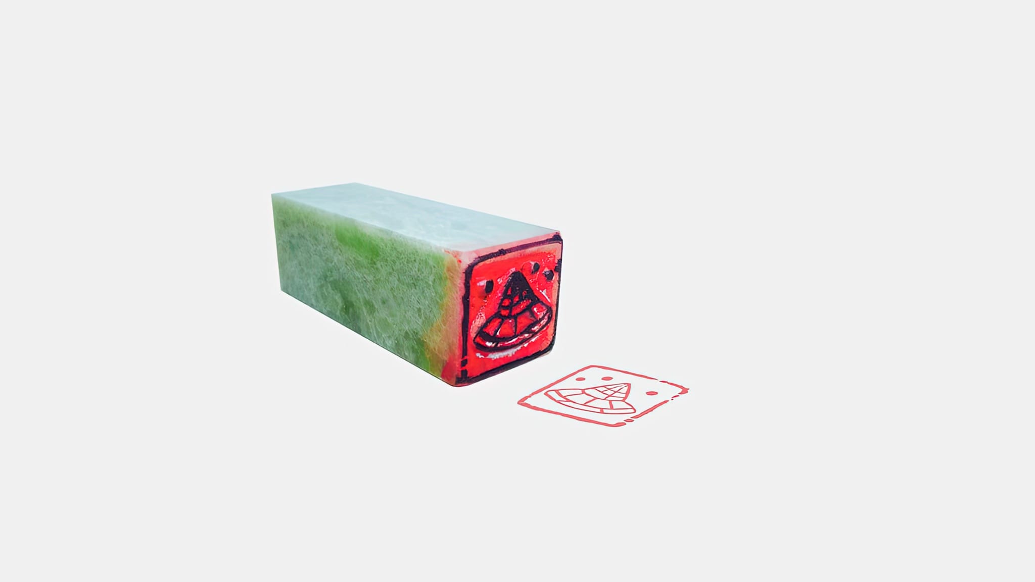
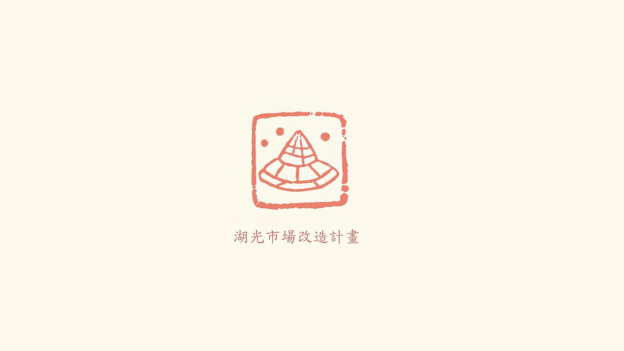
Calligraphy and Seal
One of the unique aspects of this project was the use of calligraphy in the market’s new look. Our team member, Wei Hsu Huang, created a seal and used his calligraphy skills to design the new logo. This helped to honor the market’s traditional significance while still giving it a modern touch.
Join me on this exciting journey of cultural preservation and modernization.